The marketplace nobody would touch
How a fragile, revenue-stalled surface became the Dynamic Grouped Marketplace (DGM), a grouped feed members actually understand.
Impact
+3% revenue per user against a 0.5% forecast, roughly a 6x beat
~$2.1M in incremental revenue per month at scale
+5% revenue per user (~$1M/month) from the earlier release that proved the thesis
Context
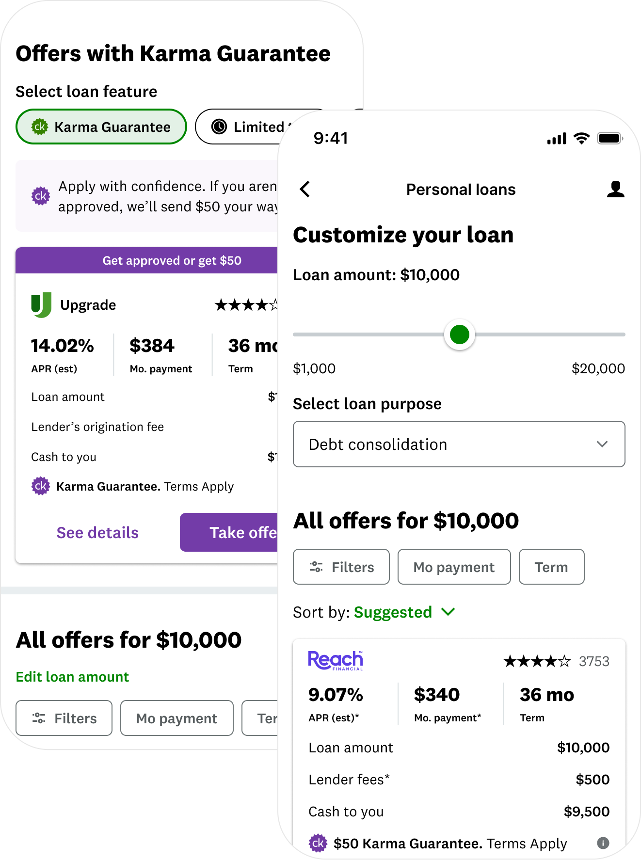
Credit Karma's personal-loans marketplace is where people go to compare loan offers from different lenders and pick one. Credit Karma earns when a member is approved and funded for a loan they found here, so what the marketplace surfaces directly drives revenue. That's why "revenue per user" is the number this team lives and dies on. The marketplace shows up as a long, scrollable list, and every offer looks about the same: a rate, a monthly payment, and how long you have to pay it back.

Inside the company, this was the surface nobody wanted to touch. It was missing its revenue goals, and it was so fragile that almost every change broke something and cost money, so the team had learned to leave it alone.

I took it on deliberately, because the real problem was not a hundred small bugs. It was one big one: the marketplace treated every person exactly the same, and it buried a high-stakes money decision under a wall of look-alike offers. That is a design problem, which means it is fixable.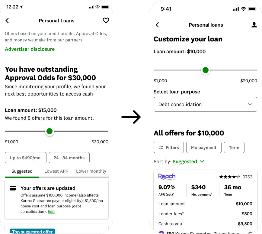
My role
Design lead across the full arc, from the first proof point through a multi-quarter redesign. The work meant owning the experience strategy and interaction design, and driving alignment across product, engineering, data science, analytics, legal, and QE. Setting the experimentation approach with the PM and analytics partners mattered just as much, because on a surface this sensitive, how the work was measured was as important as what shipped.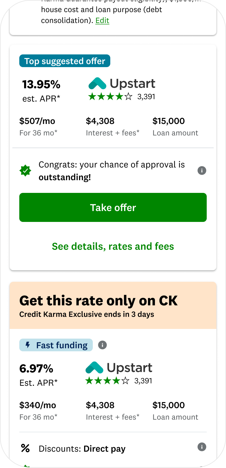
The problem
Research kept surfacing the same four pains. The marketplace did not feel personalized. Members did not trust it, because the ranking and the 'your odds of approval' labels did not match expectations. They were overwhelmed by dozens of look-alike offers stacked with badges. And whatever made an offer good was buried too deep to see.

Underneath all of it was one strategic problem: a one-size-fits-all marketplace cannot move revenue, because it speaks to no one in particular.
The bet
The plan was deliberately sequenced rather than a big-bang redesign, because the surface was too risky for that. Prove the idea small, learn, then scale.
It started with the higher-intent, existing-loan audience: a header tailored to each member's situation plus a single curated offer built from each member's own data. That release worked, and it was the first successful change to this product in a long time, which earned the room to go bigger.
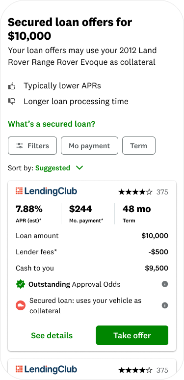
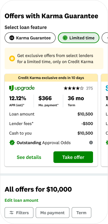
From there the insight scaled into a full structural redesign, the Dynamic Grouped Marketplace. Instead of one long list, the feed gets organized. A top-offers row surfaces the best options up front. Offers split into clear unsecured and secured sections. A shelf lets members shop by what they care about. And the offer tile got tighter, with fees made transparent.
Designing the system
This was systems work, not a screen. The pieces had to hold together and scale.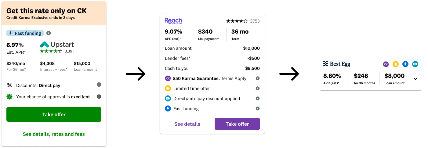
Tighter offer tile that leads with the three things people compare (APR, term, monthly payment) and runs about 20% shorter, so members see more per screen.
Top-offers section that pulls the strongest options up front so people stop digging
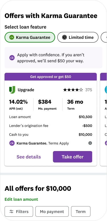
Unsecured and secured split, each section with its own filter and sort. This turned out to be the single biggest driver of the result.
A "shop by feature" shelf, a row that lets members sort by what matters to them (lowest APR, fastest funding, and so on).
The hard part
The early results were bad. Revenue was down four to five percent and clicks were soft. The easy move would have been to call the redesign a failure and roll it back.

The team dug in instead, and the losses turned out not to be the design. They were latency, a ranking bug, and plain newness as members adjusted to a new layout. So we held our nerve and worked the problem. We ran a clean comparison variant to separate the design's impact from the infrastructure noise. We phased the ramp to protect revenue. We built a new abandonment metric tied to load time to find exactly where people were dropping. Once the noise was out, the winning version came through clearly.

Holding the line on rigor when the data looked ugly and the pressure was to ship or kill is where the real work was.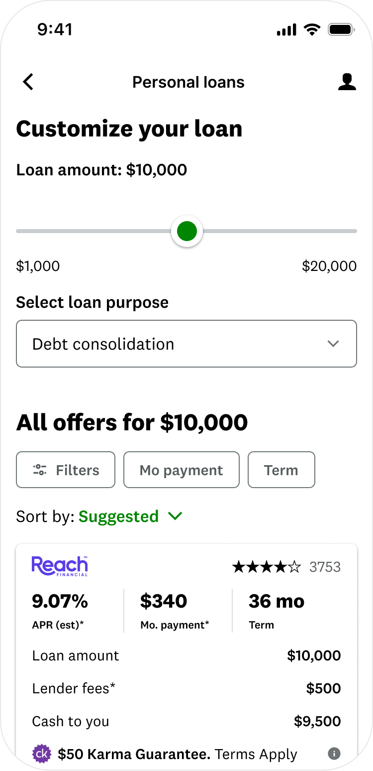
The impact
Because the feed was now grouped, the data science team could layer smarter ranking on top, ranking the whole set of offers together instead of one at a time. The design and the model compounded on each other.

That drove a 3% lift in revenue per user against a 0.5% forecast, roughly $2.1M a month, and it surfaces meaningfully lower rates at the top for many members, which is a real member win and not just a revenue one. Add the earlier release that started it all, at +5% revenue per user and about $1M a month, and the point is clear: this was not a one-time redesign. It became a foundation that kept paying off.