Designing filters people actually use
This one started with no brief. I sat down to watch members shop for loans with no agenda, noticed that almost everyone missed the filters and drowned in offers, and turned that observation into a research-led redesign. When the results came back flat, I read them closely enough to prove the flat number was actually a win, and turned the work into a foundation the marketplace still builds on.

At a glance
A flat top-line result hid two opposite stories. I segmented the data, showed exactly who the new filtering helped and who it didn't, and made the case to product and analytics to keep and expand it instead of rolling it back.
The demand was real. On a marketplace where a single member could face hundreds, sometimes over a thousand, look-alike offers, more than 20% of members who opened the new filter menu used the brand-new options, driven heavily by the new approval-odds filter.
The work compounds. Every filter a member taps now feeds offer ranking, so the redesign keeps paying off, and its patterns carried directly into the larger Dynamic Grouped Marketplace redesign.
Context
When someone shops for a loan on Credit Karma, they can land on a list of hundreds, sometimes more than a thousand, offers. Imagine opening a store with a thousand nearly identical products and no signs, no aisles, and no way to say "just show me the affordable ones."
I didn't go looking for this project. I sat in on sessions to watch members shop the Personal Loans marketplace, with no agenda beyond understanding how they moved through it. The pattern jumped out immediately: person after person missed the filter entirely, scrolled into a wall of offers, and got overwhelmed. One member put it plainly: "I only want to see the best 20 offers that fit my situation, not 200." Nobody had asked me to fix filtering. Watching it fail in front of me is what made it a project.
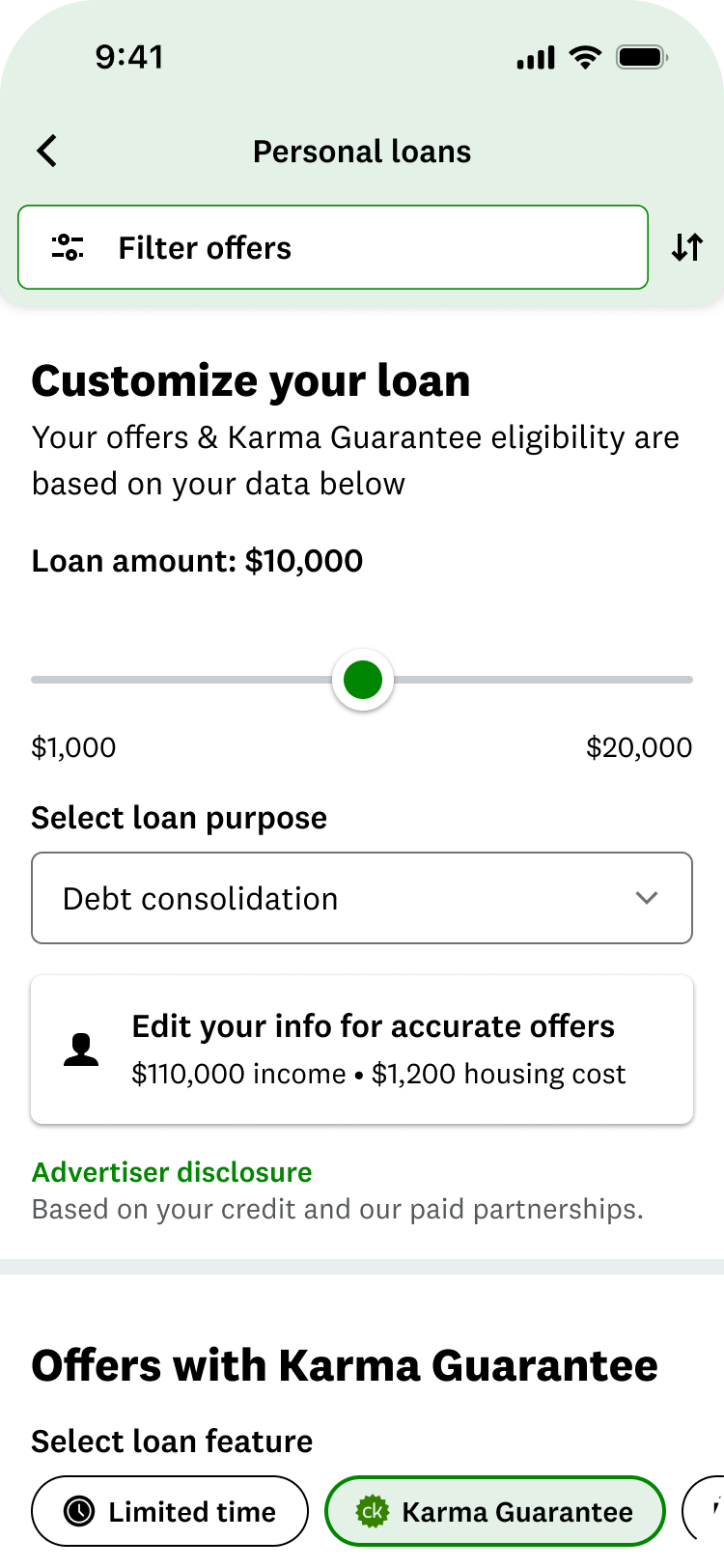
There was a filter, technically. But almost nobody used it. The entry point was easy to miss, the options didn't match what people actually cared about, and nothing told you it was working. So people got overwhelmed, and a lot of them just left.
A long list is not a feature. Without a way to cut it down to the few offers that fit, it's just a wall.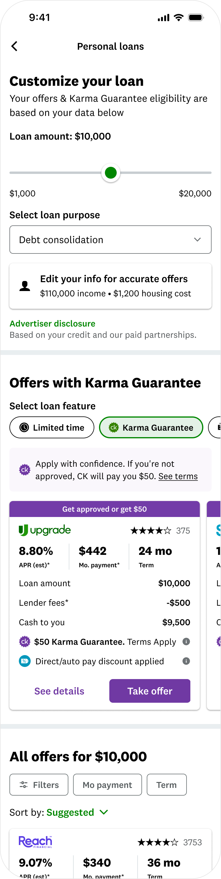
My role
I was design lead from the first research session through launch and results. I owned the research plan and moderated the sessions, drove the concept exploration and final design, and shaped how the test was set up and interpreted alongside product and analytics. When the results came back mixed, I made the case for what to do next, and I own the miss in this story as much as the win.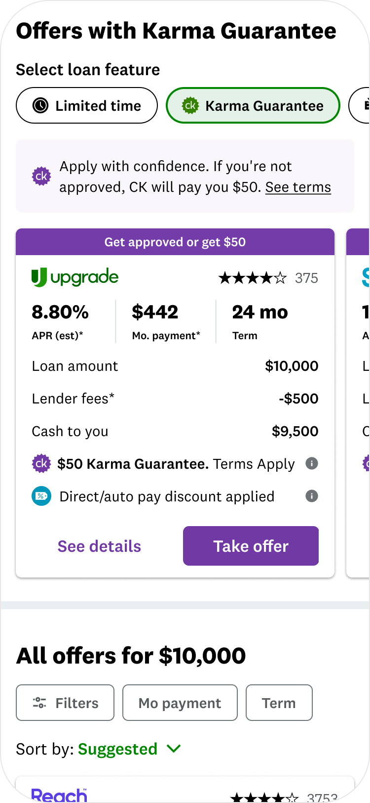
The easy assumption was that the filter just needed to be bigger. The research told a more specific story.

The real problem was a mismatch with how people narrow a big decision. Loan shoppers weigh a handful of things: the rate they'll pay, how long the loan lasts, what it costs each month, and how likely they are to be approved. The old filter buried those behind options nobody cared about, hid itself while you scrolled, and gave no feedback that anything was happening.

So I reframed the job. It wasn't "add more filters." It was to rebuild filtering around the way people actually decide.
The problem
Research first
Rather than redesign on instinct, I started the project with members and stayed there through three rounds.

Round one put five genuinely different filtering concepts in front of real loan shoppers in moderated sessions: a simple filter button, a bar that travels with you as you scroll, a full input page, a full-screen takeover, and a hybrid. The goal was to learn how people think before falling in love with any one idea.

Round two tested refined mockups against a harder question: do people even notice the filters on their own, without being pointed to them?

Round three came after the design was built, to confirm the pattern held up once it was real and not a prototype.

Participants were real shoppers across credit ranges, borrowing for real reasons: consolidating debt, fixing a roof, covering an unexpected expense.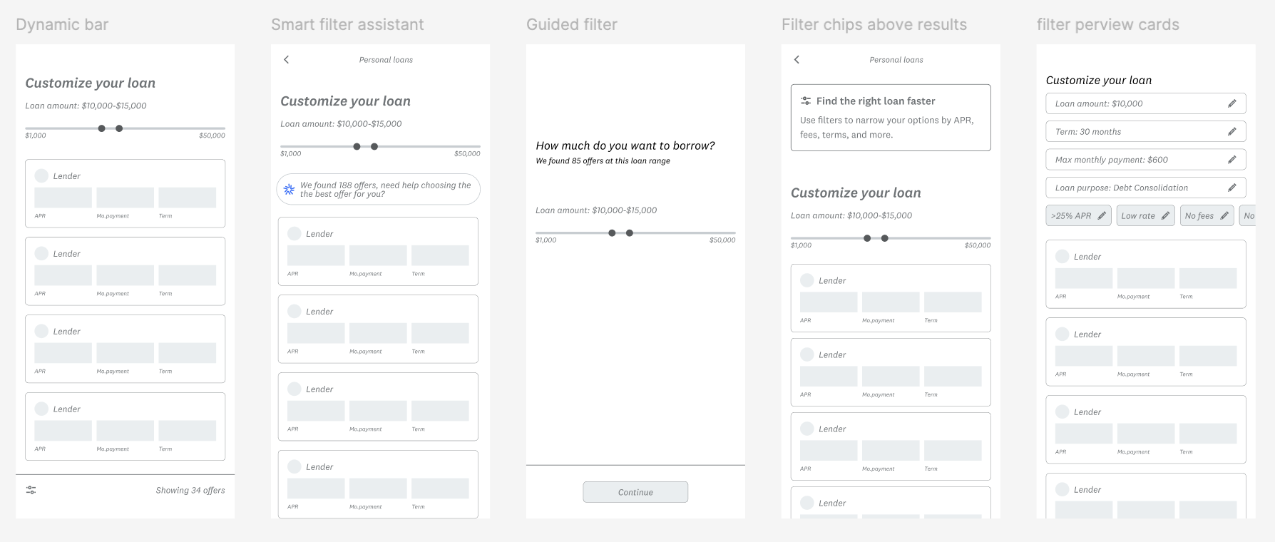

What members said
They were remarkably clear.
The filters were invisible. People kept missing the entry point entirely, and you can't use a tool you never see.
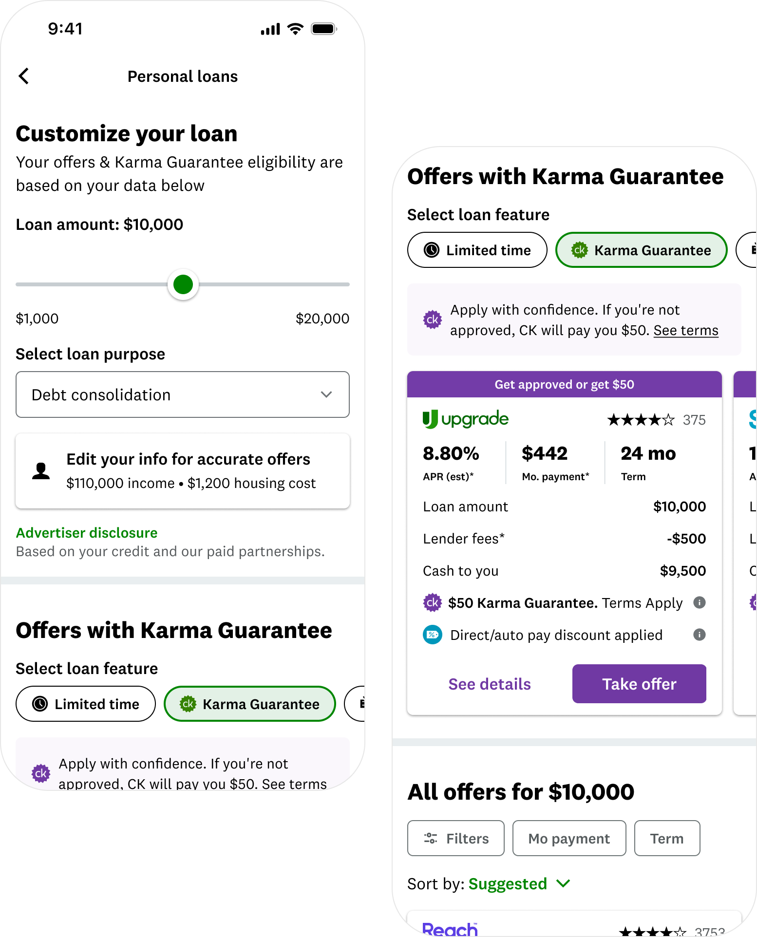
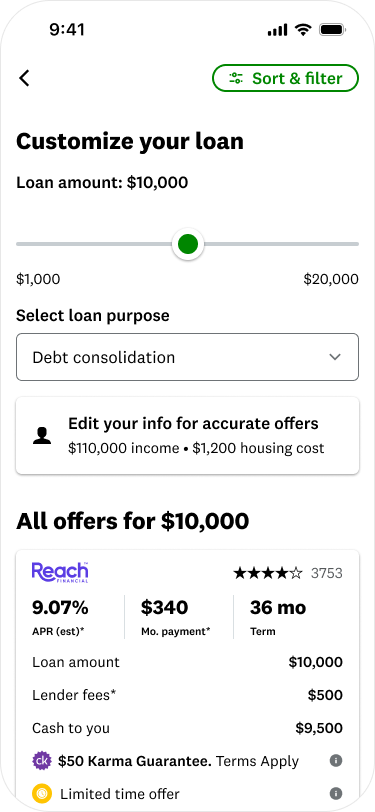
The pinned bar won, every time. Of the five concepts, the bar that travels with you as you scroll was the runaway favorite. Every single person in the study liked it. "Green is my favorite, I can narrow down before I even see the offers," one member said.
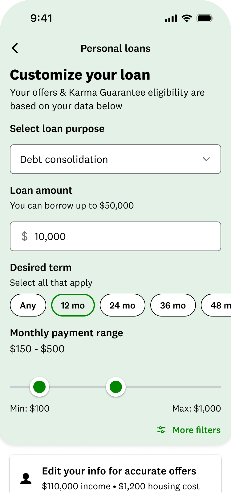
A few filters matter most. APR, term, monthly payment, and approval likelihood. Loan purpose and lender name ranked dead last.
Show me it's working. People wanted a live count of how many offers remained as they filtered, so they could trust the tool was doing something.
"If I can filter and sort, I'm good. I use it the same way I do on Amazon."
The design
Every decision traces back to something a member said.
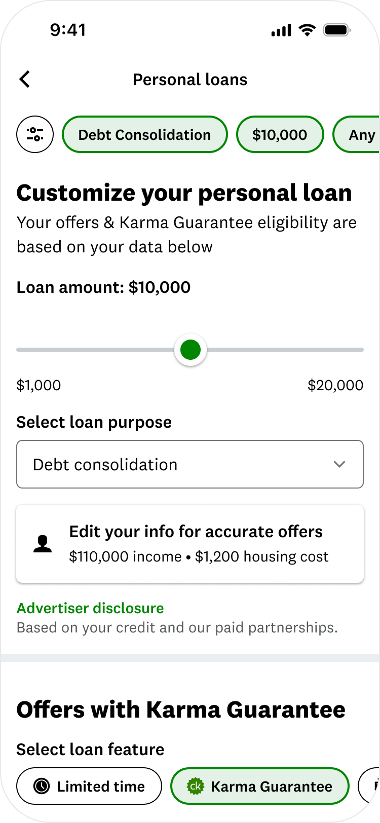
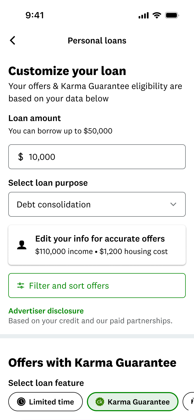
One filter system for the whole marketplace. I moved filtering up to the top level so it works across all offers, instead of small controls scattered through the page.
A pinned filter bar, not a button or a takeover. Of the five concepts, this was the only one that solved the actual problem: invisibility. A takeover would have fixed that by hijacking the whole screen. An input page added a detour before any value showed up. A hybrid added complexity nobody asked for. The pinned bar stayed exactly where members already were, in the offer list, and simply refused to disappear. I killed the other four for the same reason I picked this one: they solved visibility by adding friction, and the research said friction was already half the problem.
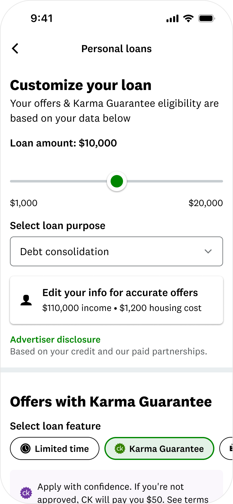
Built around how people decide. I led with what shoppers weigh most: approval odds, rate, monthly payment, and term. Practical options people asked for, like no origination fee and fast funding, sit right behind them. I cut loan purpose and lender name from the top level, because members ranked them last.
A live offer count that updates as you filter, so you can watch a thousand offers become twenty.
Built for thumbs. Tap-friendly controls, and a menu that keeps the offers visible behind it instead of taking over the screen, so members never lose their place.

Variant 3
Control (Baseline)
What the data said
I put two versions of the new filtering into a live test on a third of traffic across iOS and mobile web, with the old experience as the baseline. Revenue per user, our guardrail metric, held steady, which mattered on a surface where any regression was expensive. The rest of the results were genuinely mixed, and this is where the project got interesting.
Fewer people found the door. The old design had several labeled buttons that all led to filtering. I consolidated them into one cleaner entry, which meant fewer things to tap, and fewer people opened the filter at all. That became a lesson the team still quotes: making something look cleaner is not the same as making it more used. This one is on me, and I say so without softening it, because a flat topline number will hide exactly this kind of tradeoff if you don't go looking for it.
But the people who got inside loved it. More than 20% of members who opened the new menu used the brand-new filter options. The demand for deeper filtering was clearly real.
And the flat overall numbers hid two opposite stories. For members with only a handful of offers, the new filtering did nothing, because there was barely anything to filter. For members with lots of offers, results improved by roughly 4% in both versions, driven heavily by the new approval-odds filter. Averaged together, those two stories looked like "no change.”
The call
On paper, a flat result usually means undo it. I recommended the opposite: keep it and expand it, and I made that case to product and analytics.

Here's why. A marketplace this size simply needs good filtering. The heavy use inside the menu proved people wanted it. The weak entry point was a fixable problem, not a flaw in the system itself. And the new setup came with two bonuses: it opened the door to the next round of improvements, and every filter a member taps tells us a little more about what they want, which helps put better offers in front of them.

So a result that looked flat on the surface became a foundation. The patterns carried straight into the Dynamic Grouped Marketplace redesign, where the same instinct, that a one-size-fits-all list can't work for a decision this personal, became the whole premise.